Mayo Clinic Observership
Mayo Clinic Observership
Mayo Clinic Observership
| Product Design |
| Product Design |
| Product Design |
Healthcare UX
Healthcare UX
Healthcare UX
Designing a smarter companion for chemotherapy patients
Designing a smarter companion for chemotherapy patients
Designing a smarter companion for chemotherapy patients
A patient-centered digital health platform that replaces overwhelm with clarity — through AI, visual symptom tracking, and personalized education.
A patient-centered digital health platform that replaces overwhelm with clarity — through AI, visual symptom tracking, and personalized education.
A patient-centered digital health platform that replaces overwhelm with clarity — through AI, visual symptom tracking, and personalized education.


10
10
10
Peer-reviewed studies synthesized
Peer-reviewed studies synthesized
Peer-reviewed studies synthesized
08
08
08
Cancer care apps
benchmarked
Cancer care apps
benchmarked
Cancer care apps
benchmarked
04
04
04
Core Flows tested
Core Flows tested
Core Flows tested
TL;DR below, or enjoy the scroll. 👇

Client: Mayo Clinic
Role: Product Designer · UI Design
Team: 7 people multidisciplinary team, 2 Oncologists from Mayo Clinic
Timeline: 16 weeks
Methods: Literature Review · Co-Creation · Persona Development · Think-Aloud Usability Testing · MoSCoW Prioritization · Iterative Prototyping
Tools: Figma, FigJam, Miro
Client: School for Engineering of Matter, Transport and Energy, Arizona State University
Role: Communications Assistant, Ira A Fulton Schools of Engineering, ASU
Tools: Google Forms, Figma, WAVE Web Accessibility Evaluation Tool
Timeline: 4 months
Project Overview
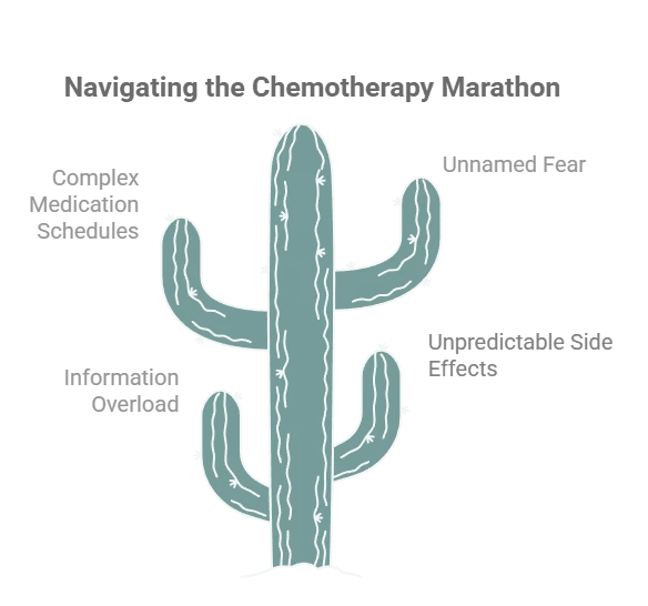
Chemotherapy is not just a medical experience — it's a logistical, emotional, and cognitive marathon. Patients leave their first appointment with a 200-page binder they can barely process, and then go home to manage unpredictable side effects, complex medication schedules, and a fear they can't always name.
Mayo Clinic tasked our team with designing a comprehensive digital application that empowers chemotherapy patients with personalized education, real-time support, and reliable resources — all in one place.
The result is ChemoBuddy: a platform that combines a conversational AI chatbot, a 3D visual symptom tracker, and a unified treatment dashboard to meet patients where they are — physically, emotionally, and cognitively.
Project Overview
Chemotherapy is not just a medical experience — it's a logistical, emotional, and cognitive marathon. Patients leave their first appointment with a 200-page binder they can barely process, and then go home to manage unpredictable side effects, complex medication schedules, and a fear they can't always name.
Mayo Clinic tasked our team with designing a comprehensive digital application that empowers chemotherapy patients with personalized education, real-time support, and reliable resources — all in one place.
The result is ChemoBuddy: a platform that combines a conversational AI chatbot, a 3D visual symptom tracker, and a unified treatment dashboard to meet patients where they are — physically, emotionally, and cognitively.
My Role
I was one of seven designers on this project, contributing across every phase — from literature synthesis and co-creation facilitation to UI design and usability testing.
My specific contributions included:
Synthesizing literature review findings into design requirements
Leading persona development and scenario mapping
Designing and iterating on the onboarding flow and dashboard UI
Conducting and documenting think-aloud usability testing
Refining the visual hierarchy and emotional design language post-feedback
This project strengthened my ability to:
design product flows for high-stakes healthcare contexts,
translate research into integrated feature strategy,
think critically about AI safety and escalation,
and create calmer, more scannable experiences for users under stress.

Context
Context
Problem Statement
Current chemotherapy education often fails at the exact moment patients need it most. Patients leave with too much generic information, too little personalized guidance, and no single place to manage treatment logistics or understand whether a symptom is expected or urgent.
Problem Statement
Current chemotherapy education often fails at the exact moment patients need it most. Patients leave with too much generic information, too little personalized guidance, and no single place to manage treatment logistics or understand whether a symptom is expected or urgent.
Core User Pain Points
Problem Statement
Current chemotherapy education often fails at the exact moment patients need it most. Patients leave with too much generic information, too little personalized guidance, and no single place to manage treatment logistics or understand whether a symptom is expected or urgent.
Design Challenge
How might we design an AI-powered healthcare experience that delivers just-in-time chemotherapy education, supports safer symptom reporting, and reduces cognitive load for both patients and caregivers?
Design Challenge
How might we design an AI-powered healthcare experience that delivers just-in-time chemotherapy education, supports safer symptom reporting, and reduces cognitive load for both patients and caregivers?
Design Challenge
How might we design an AI-powered healthcare experience that delivers just-in-time chemotherapy education, supports safer symptom reporting, and reduces cognitive load for both patients and caregivers?
Design Goals
The product needed to:
make critical information easy to scan during moments of fatigue and stress,
use AI to support education and navigation without crossing into diagnosis,
personalize content by treatment phase and symptom context,
centralize fragmented tasks into one product ecosystem,
and support caregivers without taking control away from patients.
Core User Pain Points

User Research
User Research
Literature Review
We analyzed 10 peer-reviewed studies on digital health, health literacy, mHealth interventions, and AI in oncology patient education. Key findings:
Health literacy gaps are real but not addressed by current tools. 60% of studies found no significant link between literacy and treatment adherence — not because literacy doesn't matter, but because existing educational approaches fail to bridge the gap. (Ha et al., 2022)
Multimodal content achieves 3x higher patient engagement than text-only platforms. (Shaffer et al., 2023)
AI chatbots outperformed traditional nurse-led education in reducing physical and psychological symptoms in one RCT — but come with risks around misinformation and clinical boundaries. (Tawfik et al., 2023; Lawson McLean & Hristidis, 2025)
No existing app integrates education, symptom tracking, coordination, and caregiver support in one place.
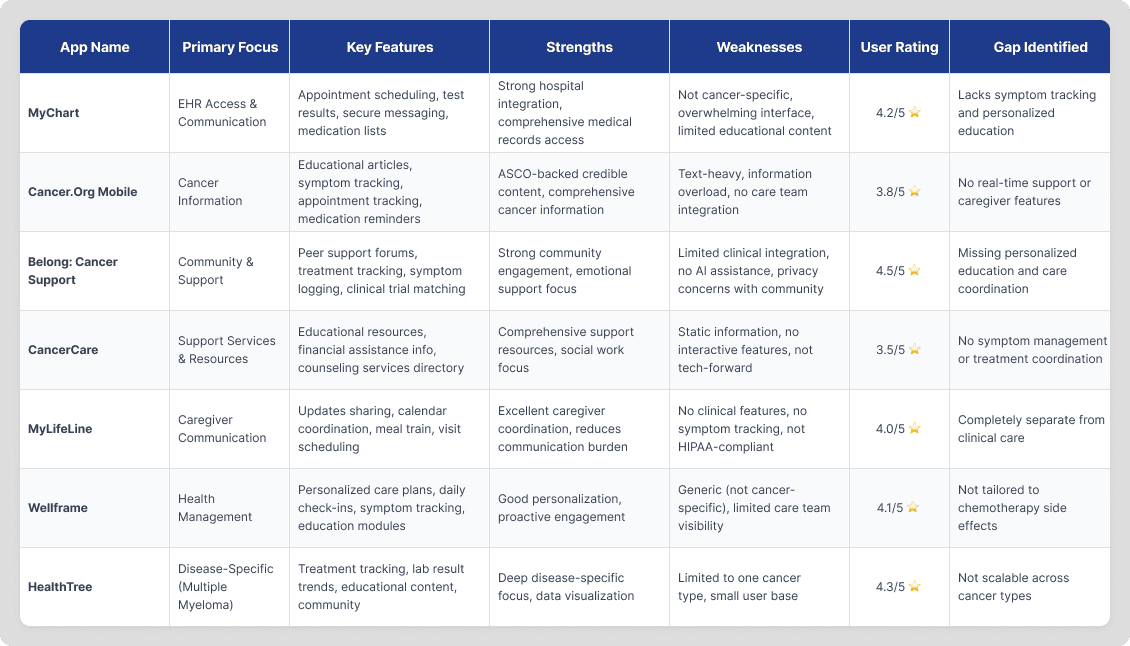
Competitive Analysis
The findings directly influenced:
We evaluated 8 apps — MyChart, Cancer.Net Mobile, Belong, CancerCare, MyLifeLine, Wellframe, HealthTree, and RxRemind. The pattern was consistent:
Apps were either information-heavy and overwhelming, or task-focused and too narrow.
None offered integrated, real-time, personalized support across the full treatment journey.
Literature Review and Gap Analysis
Literature Review and Gap Analysis


Competitive Analysis
Competitive Analysis
User Research
User Research
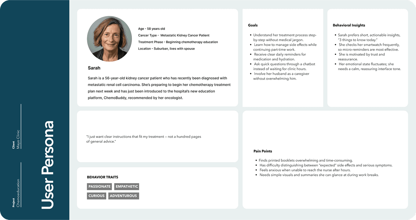
Persona Development
Because live patient recruitment was outside the project scope, we were careful to base personas and flows on published patient journey research and clinical guidance.
Our primary design persona was Sarah L. Sarah is a 56-year-old patient who has recently been diagnosed with metastatic renal cell carcinoma. She's preparing to begin her chemotherapy treatment plan next week and has just been introduced to the hospital's new education platform. She was characteristically recommended by her oncologist.
"I just want clear instructions that fit my treatment, not a hundred pages of general info."
"I just want clear instructions that fit my treatment, not a hundred pages of general info."
User Research
Defining user needs and insights based on persona
Defining user needs and insights based on persona

Three design principles emerged from Sarah's scenario:
Immediacy — She needs answers now, not a library
Simplicity — She cannot navigate complex interfaces when exhausted
Visibility — Her husband needs updates without Sarah having to initiate them
Design Implications
These insights directly informed:
Persona development
Journey mapping
Centralized navigation restructuring
Exploration of dashboard-style information grouping
Three design principles emerged from Sarah's scenario:
Immediacy — She needs answers now, not a library
Simplicity — She cannot navigate complex interfaces when exhausted
Visibility — Her husband needs updates without Sarah having to initiate them
Design Process
Design Process
Co-creation and HMW workshops
We reframed pain points into opportunity areas and generated multiple “How Might We” questions around reassurance, symptom reporting, and treatment coordination.
Feature prioritization
From 40+ potential ideas, we defined an MVP centered on a chatbot, symptom tracker, and dashboard.
Persona-based scenario mapping
We used Sarah’s treatment journey to pressure-test the clarity and timing of every major feature.
Co-creation and HMW workshops
We reframed pain points into opportunity areas and generated multiple “How Might We” questions around reassurance, symptom reporting, and treatment coordination.
Co-creation and HMW workshops
We reframed pain points into opportunity areas and generated multiple “How Might We” questions around reassurance, symptom reporting, and treatment coordination.
Co-creation and HMW workshops
We reframed pain points into opportunity areas and generated multiple “How Might We” questions around reassurance, symptom reporting, and treatment coordination.
Co-creation and HMW workshops
We reframed pain points into opportunity areas and generated multiple “How Might We” questions around reassurance, symptom reporting, and treatment coordination.


Design Process
User Research
Design Process
Must Haves that emerged:
24/7 AI chatbot with clinical guardrails
Visual symptom tracker with body mapping
Unified appointment and medication dashboard
Must Haves that emerged:
24/7 AI chatbot with clinical guardrails
Visual symptom tracker with body mapping
Unified appointment and medication dashboard
Must Haves that emerged:
24/7 AI chatbot with clinical guardrails
Visual symptom tracker with body mapping
Unified appointment and medication dashboard
Deliberately deferred:
Social media integration
Gamification
Peer community features
Deliberately deferred:
Social media integration
Gamification
Peer community features
Deliberately deferred:
Social media integration
Gamification
Peer community features
Design Concepts:
We developed three complementary concepts that ultimately merged into one integrated platform:
Concept A — 3D Symptom Management System A visual body map where patients tap affected areas, rate severity, and add photos or voice notes. Designed to eliminate the "I don't know how to describe the pain" communication barrier.
Concept B — Multimodal Education Hub Content delivered in video, audio, flashcards, and plain-text formats — triggered contextually based on the patient's current treatment phase and reported symptoms.
Concept C — Treatment Coordination Dashboard A unified command center: appointments with prep checklists, visual medication schedules, care team directory, and a "Today's Focus" section that surfaces only what matters right now.

Design
Process
Design Process
Design Process
Wireframes
Working in Figma, we translated our co-creation insights and MoSCoW priorities into low-fidelity clickable prototypes across core flows — onboarding and dashboard, the conversational chatbot, multimodal learning, and the symptom tracking system.
Visual fidelity was intentionally kept minimal so that stakeholder and mentor feedback stayed focused on interaction patterns and information architecture, not aesthetics.
Early wireframes helped us surface structural decisions quickly:
Where does the patient land after onboarding — and what does "done" feel like?
How much information should the dashboard surface upfront vs. on demand?
How does the chatbot hand off to emergency protocols without breaking conversational flow?
The friction points that emerged during think-aloud testing directly shaped every major iteration that followed.

Design Process
Design Process
Design System
Every design decision in ChemoBuddy was made with one constraint in mind: this interface will be used by someone who is exhausted, anxious, or in pain. The design system reflects that.
Color- The palette is anchored in deep teal as the brand primary, supported by softer secondary and tertiary tones that feel calm without being sterile. Red is reserved strictly for alerts and emergency states — never decorative — so patients learn to trust what color signals.
Typography- A structured type scale from Caption through Large Title, across Regular, Medium, Semi Bold, and Bold weights, gives the interface a clear hierarchy. Headers guide without overwhelming; body text stays readable at a glance.
Components- Buttons follow a three-level hierarchy — outlined for secondary actions, soft-filled for standard interactions, and solid teal for primary CTAs. The bottom navigation (Home, Chat, Education) keeps the three core features always one tap away, with clear active states that orient users without effort.
Tone in UI- Even the content cards — like "Coping with Chemo Fatigue: Small steps to manage energy and feel reassured" — were written to sound like a calm, knowledgeable friend. The Educational Basket format options (Video, Audio, Text) appear as approachable chips, not clinical toggles.

Design Process
Design Process
Testing & Iteration
We ran structured think-aloud usability sessions with Dr. Umar Afzal, our oncology mentor, alongside two participants role-playing as patient Sarah and her caregiver. What made these sessions particularly valuable was that Dr. Umar didn't just evaluate the interface — he reviewed it against actual clinical literature, ensuring our chatbot content and escalation protocols reflected real oncology practice.
Each participant completed four task scenarios:
Set up your account and reach your dashboard
Ask the chatbot about your chemotherapy drugs
Log a severe headache with location and intensity
Request resources for managing fatigue

Cross-team usability review session with clinical mentor Dr. Umar Afzal
Cross-team usability review session with clinical mentor Dr. Umar Afzal

Dr. Umar referencing clinical literature on renal cell carcinoma treatment protocols via Mayo Clinic's UpToDate database — ensuring chatbot content was medically grounded
Dr. Umar referencing clinical literature on renal cell carcinoma treatment protocols via Mayo Clinic's UpToDate database — ensuring chatbot content was medically grounded

Live prototype review of onboarding flow in Figma during mentor feedback session
Live prototype review of onboarding flow in Figma during mentor feedback session
Design Process
Design Process
What changed after testing
Chatbot → Educational Basket
The chat experience initially felt too linear and text-heavy. We added multimodal actions after responses: Video, Audio, Article, and Simplify.
AI support → Red-flag escalation
We introduced a clearer safety layer for symptoms like fever, chest pain, and breathing difficulty, with immediate escalation actions.
Onboarding → Visible sync confirmation
Users needed reassurance that treatment data had synced correctly, so we added a clearer connection state and confirmation screen.
Dashboard → Emotional reinforcement
We added milestone messaging and a recovery-state concept so the product acknowledged emotional progress, not just medical status.
Symptom logging → Progressive disclosure
We reworked symptom input into guided body zones and confirmation feedback to reduce effort and increase clarity.
Final Design
Final Design
ChemoBuddy is an AI-enabled chemotherapy support concept designed around one core idea: patients need clear, contextual support throughout the treatment journey, not just a one-time education session.
The final product brings together five connected experience layers.
Personalized onboarding and dashboard
A lightweight onboarding flow connects the experience to treatment-specific information and reduces repetitive data entry. Once inside, the dashboard surfaces today’s priorities, upcoming appointments, medication schedules, care team contacts, and treatment progress in one place.
This reduces cognitive load by helping patients focus on what matters now instead of searching across multiple systems.
Onboarding Screens
Onboarding Screens
Onboarding Screens
Since users may be emotionally fragile during diagnosis, the onboarding focuses on empathy, calm pacing, and trust.
Since users may be emotionally fragile during diagnosis, the onboarding focuses on empathy, calm pacing, and trust.
Dashboard Screens
Dashboard Screens
Dashboard Screens
The dashboard serves as the “home base” for patients who may have limited energy. It combines clinical data with emotional support elements, using iconography and gentle color accents to guide attention.
The dashboard serves as the “home base” for patients who may have limited energy. It combines clinical data with emotional support elements, using iconography and gentle color accents to guide attention.
The dashboard serves as the “home base” for patients who may have limited energy. It combines clinical data with emotional support elements, using iconography and gentle color accents to guide attention.
Final Design
Final Design
AI-powered conversational guide
The chatbot provides 24/7 natural-language support for treatment questions, side effects, and logistical concerns. It is intentionally designed with clinical boundaries: it educates, reassures, and escalates, but does not diagnose or prescribe.
This made AI feel useful in a healthcare setting without creating false confidence.
New user flow - Chatbot
New user flow - Chatbot
New user flow - Chatbot
Our chatbot is designed to act like a virtual nurse or pharmacist, someone patients can rely on throughout their chemotherapy education journey. Because all patient information is captured during onboarding and securely pulled from the EHR, the chatbot always knows the user’s exact diagnosis, treatment plan, and medication schedule. This allows it to deliver fully personalized education rather than generic instructions.
In this use case, the patient is beginning their chemotherapy journey. For this patient, the system identifies that they will be receiving Cabozantinib and Nivolumab. So, in the very first education module, the chatbot introduces these medications, what they do, how they work together, and common symptoms they may want to track. Instead of overwhelming them with clinical terminology, the chatbot breaks the information to watch for, and in the end of each video, a small quiz comes which is optional, to make sure the user understood the module.
By doing this, we ensure the patient not only receives the right information at the right time but also feels supported, informed, and more confident before starting treatment.
Final Design
Final Design
Multimodal education
Rather than relying on text-heavy materials, ChemoBuddy offers educational content in video, audio, article, and simplified formats. This makes information more usable across different literacy levels, energy states, and treatment phases.
The goal was to make learning flexible, repeatable, and easier to act on.
Multimodal education
Multimodal education
Multimodal education
The education hub delivers trustworthy chemo guidance in video, audio, and text formats, allowing patients to learn in the way that feels easiest that day.Content adapts to the patient’s treatment phase, making learning feel timely and relevant rather than overwhelming.
The education hub delivers trustworthy chemo guidance in video, audio, and text formats, allowing patients to learn in the way that feels easiest that day.Content adapts to the patient’s treatment phase, making learning feel timely and relevant rather than overwhelming.
The education hub delivers trustworthy chemo guidance in video, audio, and text formats, allowing patients to learn in the way that feels easiest that day.Content adapts to the patient’s treatment phase, making learning feel timely and relevant rather than overwhelming.
Final Design
Final Design
4. Visual symptom tracking
The symptom tracker uses an anatomical body map, severity scales, optional photo upload, and contextual follow-up prompts to help patients communicate symptoms more clearly.
This turns vague descriptions into more structured information for care teams and creates a better bridge between patient experience and clinical action.
Symptom tracker
Symptom tracker
Symptom tracker
The symptom tracker uses 3D body mapping and simple severity scales to help patients communicate discomfort visually, without needing complex medical vocabulary. Progressive zoom and labeled regions make it easy for patients with low health literacy to record where it hurts and how intense it feels. This turns vague symptoms into clear, structured information for the care team.
The symptom tracker uses 3D body mapping and simple severity scales to help patients communicate discomfort visually, without needing complex medical vocabulary. Progressive zoom and labeled regions make it easy for patients with low health literacy to record where it hurts and how intense it feels. This turns vague symptoms into clear, structured information for the care team.
Final Design
Final Design
5. Red-flag safety and escalation
When symptoms suggest potential danger, the experience shifts from conversational guidance to urgent escalation. Instead of continuing the normal flow, the product interrupts with clear warning language and one-tap next steps such as contacting the clinic or locating emergency care.
This was one of the most important product decisions in the entire concept because it established trust without overstepping clinical boundaries.
Redflag symptom
Redflag symptom
Redflag symptom
Red-flag detection monitors patient inputs for high-risk symptoms such as severe fever, chest pain, or difficulty breathing. When detected, the system immediately interrupts the flow with a high-contrast alert.
This ensures patient safety by giving instant guidance when urgent action is needed, without causing unnecessary alarm.
Impact
Impact
Expected Outcomes
Reduced unnecessary ER visits — Reliable symptom guidance normalizes expected side effects and ensures timely escalation of genuine emergencies
Improved treatment adherence — Visual medication reminders, appointment prep checklists, and accessible education reduce drop-off
Reduced caregiver burden — Automatic notifications mean caregivers can support proactively without burdening the patient to communicate
Better clinical decision-making — Structured symptom data (with location, severity, and photos) gives providers richer context than a vague phone call

Key Learnings
Key Learnings
The biggest design challenge wasn't adding features — it was deciding what to remove. Every stakeholder session surfaced something new that "would be nice to have." MoSCoW prioritization kept us honest: a platform that does five things well will always serve Sarah better than one that attempts twenty.
The other shift was understanding that in healthcare UX, timing matters more than comprehensiveness. The right answer at 2 AM — even a simple one — is worth more than a thorough PDF that arrives when the anxiety has already peaked.
This project reinforced that effective health technology must simultaneously achieve clinical credibility and emotional resonance. Information alone is insufficient when facing life-threatening illness.
Going
Forward
Going Forward
Moving forward, the next steps would focus on refining and validating the design through:
Clinical Validation — IRB-approved pilot with 20–30 actual oncology patients across diverse cancer types and treatment regimens.
ML-Driven Personalization — Move from rule-based content recommendations to machine learning models that adapt to individual engagement patterns and symptom trajectories.
Caregiver Portal — Multi-role access (primary caregiver sees all, extended family sees appointments only, friends see task coordination).
Provider Dashboard — Clinician-facing interface surfacing patient-reported symptoms, red-flag alerts, and educational engagement metrics.
Multilingual Accessibility — Localization for Spanish, Mandarin, and Vietnamese with cultural adaptation beyond direct translation.
We’ve already started exploring desktop integration as the next step for ChemoBuddy. The goal is to extend the mobile experience into a provider-facing dashboard where care teams can review symptom reports, red-flag alerts, and treatment progress more efficiently.
This would help connect the patient’s at-home experience with the clinical workflow, making ChemoBuddy a more complete cross-platform healthcare product.

Next Project: User Research

Next Project: User Research
SEMTE Graduate Resources Website
Next Project: User Research